
")
The spiffiest football kits for the 2021/22 season.
The new season is coming at us in full force. Brands have been revealing their new kits towards the end of the season, getting their stars to don their flashy new jerseys before they head off to Euro 2020.
Below, we list what we think are some of the hyped kits that look just as good on the pitch as it will on the streets. The brands have gone for a very simple look this season with a few flashes of the audacious.
Editor’s note: At time of publishing, not all kits have been announced by the clubs. The BOOTHYPE team will be updating this list throughout the current off-season period.
Paris Saint-Germain Away
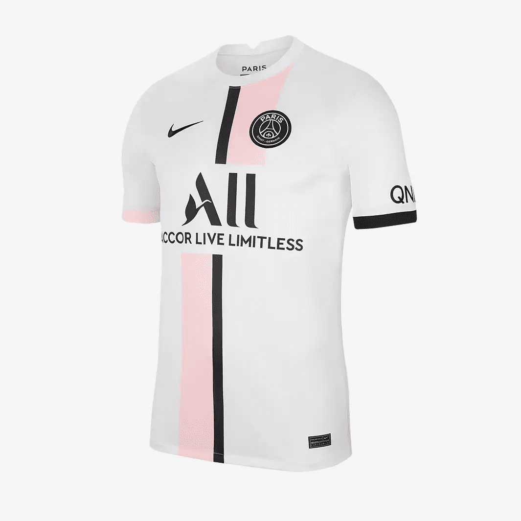
Pastel Pink
PSG Away 2021/22
Multiple stores
Nike claims that the Paris Saint-Germain 2021-22 away kit is inspired by the city’s suburbs, colloquially known as Paname. Honestly, I don’t know much about Paname or this link to the area but this is a kit that’s worthy of Parisian style and class.
Honestly, Nike x PSG can do very little wrong with their kits as they seem to have a banger every season.
Inter Milan Home
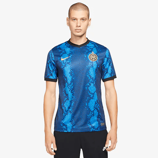
Milanese Viper
Inter Milan Home 2021/22
Multiple stores
You don’t always get provocative designs with home kits as there are only so many ways you can get creative with the tried and test club colours. Nike didn’t get the memo as they went big on Inter Milan’s mythology of the Milanese viper – Il Biscione.
What you get is one of the most original football kits in years with the snake skin design displaying two tones of blue, giving you a pseudo stripe formation. A modern classic.
Inter Milan Away
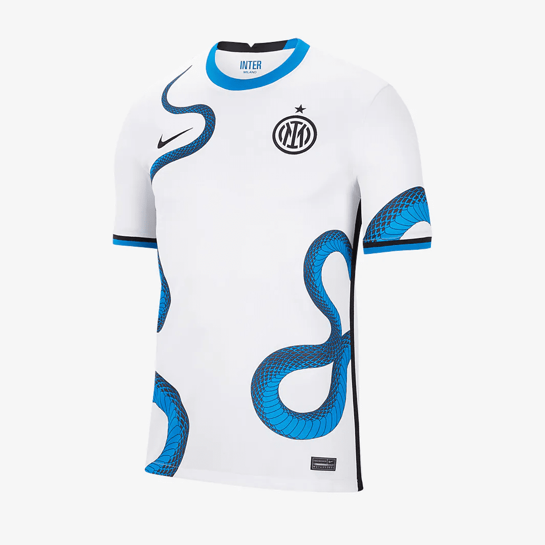
Ssssslithering snakes
Inter Milan Away 2021/22
Multiple stores
It’s a dual combo by Inter Milan. They’re still channelling Il Biscione with a less busy design than the home kit, but equally captivating. Nike’s designed a white base as a backdrop for the mythical snake to slither all across the upper.
Provocative, sensational and a must-have for those who like to be just a little different.
Manchester United Away
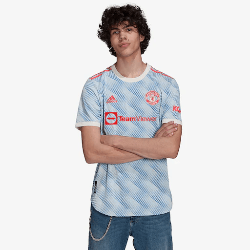
Modern Classic
Manchester United Away
Multiple stores
Despite an underwhelming home kit, the away kit is where the business is at. Manchester United fans can hark bark to a simpler era of Bryan Robson and Denis Irwin with this away kit inspired by United’s iconic away jersey from 1990-92.
Will Sancho and Pogba push them to glory? We’ll see but at least they’ll romp ahead with swagger.
Liverpool Away
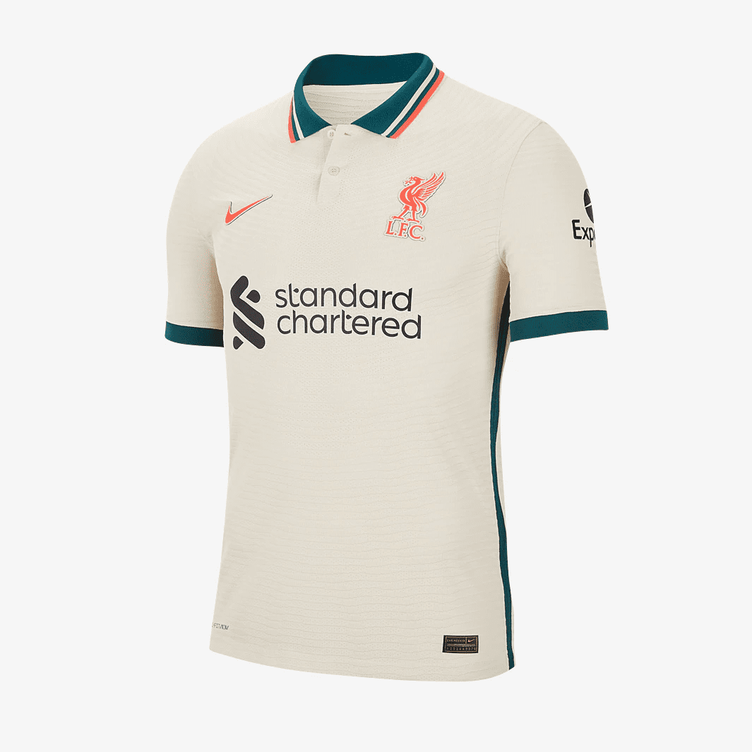
The Spirit of 96/97
Liverpool Away 2021/22
Multiple stores
Our first sneak peeks had the Liverpool away looking pretty drab but the final product looks much better on the eye. The “stone white” base is inspired by The Three Graces, the collection of buildings that comprise the city’s iconic skyline.
But it’s the green and crimson tips that bring the flavour along the collar, logos and sleeve cuffs. A simple but classy number.
Arsenal Away
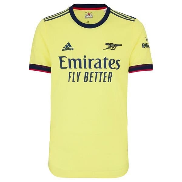
Cannon Power
Arsenal Away
Multiple stores
Yellow and blue are traditional Arsenal away colours though adidas have modified this one slightly. This iteration is a slightly softer yellow called “Pearl Citrine” (rolls eyes) while a much darker shade of blue adorns the trims such as the collar and sleeve cuffs.
One to delight fellow Gooners is the changing out of the club crest for the cannon to add a layer of vintage appeal.
Arsenal Third
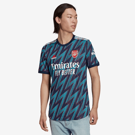
Dazzling lightning
Arsenal Third
Multiple stores
Arsenal and adidas are tugging at nostalgia again, this time with the “lightning” kit from the early 90s. It’s loud and bold and even comes with an excellent promotional video. I absolutely love this and have ordered one already myself.
Shame that Arsenal’s on-pitch game is nowhere as good as their marketing and kits.
Manchester City Home
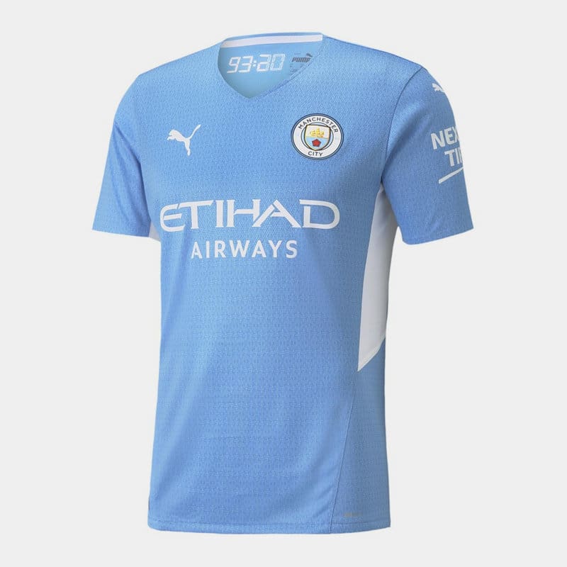
93:20
Manchester City Home 2021
Multiple stores
Manchester City is growing its rich history during the Abu Dhabi era and none encompasses that moment like the 93:20 moment – “AAGGGUEERROOOO”. Puma marks that moment with City’s 2021/22 kit with the digital clock print boldly flashing at the label behind the next.
That digital clock motif forms a subtle print across the entire kit too, which adds a cool texture to a simple kit.
Bayern Munich Away
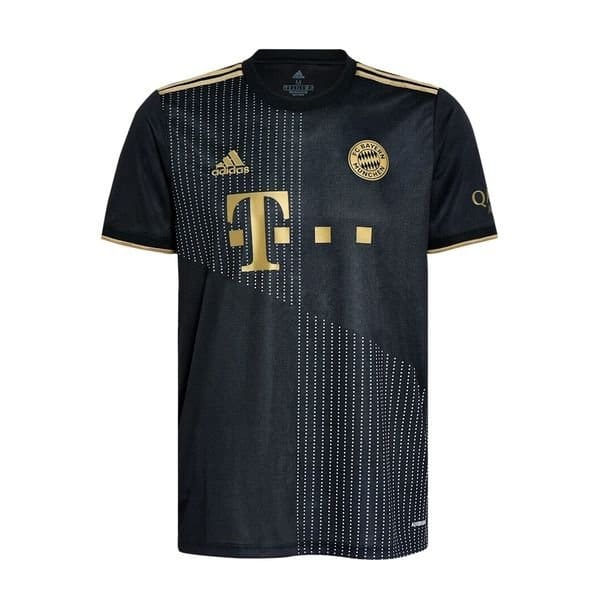
Gold Class
Bayern Munich Away
Multiple stores
You can hardly go wrong with black and gold. This classy away kit for the German champions is inspired by the Münchner Kindl, meaning “Munich child” in English, which forms the city’s coat of arms. The Bayern Munich away kit takes on the black aesthetics with the gold trims, akin to the robes worn by the mascot.
The coat of arms is featured on the back of the jersey with a understated striped and dotted design taking centre stage on the front.
Marseille Home
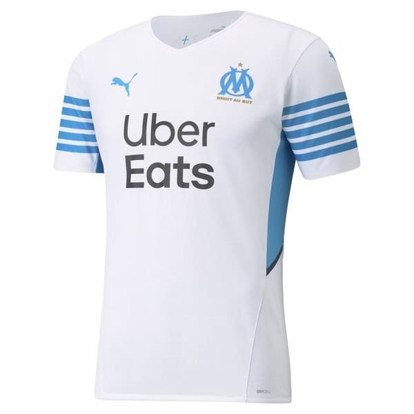
Fresh Flow
Marseille Home
Multiple stores
Puma’s primary jersey template has been pretty simple this season. A thin neckline and V-neck collar and a relatively loose fitting top. None of the Puma designs standout as much as the Olympique de Marseille home kit.
A clean white kit is punctuated by modern baby blue stripes on the sleeves – one for those who love a fresh look.
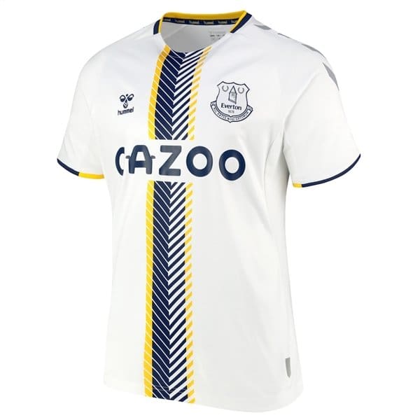
Everton Away

Retro Chic
Everton Away
Multiple stores
In an industry that tries to make every football kit somewhat fashionable, it is refreshing to see that Hummel’s kits always look like football jerseys. And Everton’s away top is no exception.
Inspired by the club’s original uniform dating from 1881 the shirt harks back to the days when Everton were nicknamed ‘the Black Watch’ for their kit’s resemblance to that of the famous Army regiment. That orange sash adds a touch of class on top of the black chevrons across the shoulders.
A lovely piece for the People’s Club.
Everton Third
Spirit of '58
Everton Third
Soccer.com
Another lovely Everton kit where they fully embrace the Hummel chevrons. This kit is a throwback to 1958 where Everton first added some gloss to their football kit by moving away from solid colours.
They had a white shirt with three horizontal stripes across the chest in yellow/blue/yellow and the rest, as they say, is history.
Manchester City Away
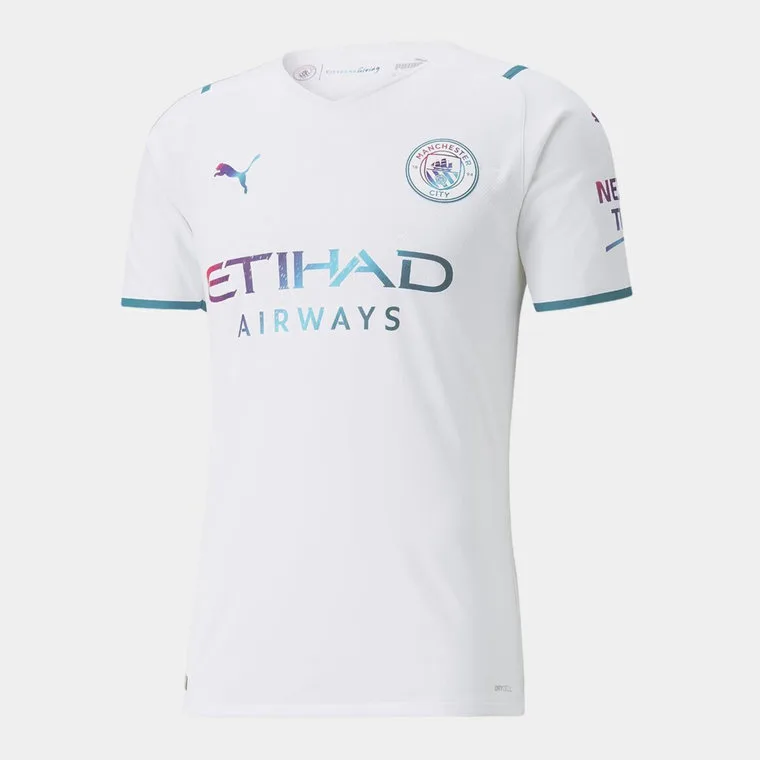
Dope Dyed
Manchester City Away 2021/22
Prodirect Soccer
Puma have always let their creative juices flow with the City Away kits and this season is not different. Not only do the kits look good, they’re also more environmentally friendly, consuming less water during production through a special Dope Dye manufacturing process.
The kit also pays tribute to the Manchester City’s global charity initiative – Cityzens Giving, which raises awareness through football to helps millions across the world have better access to safe water through.
Bayern Munich Third
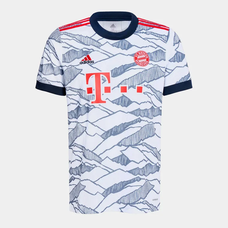
Sublimated Peaks
Bayern Munich Third 2021/22
Prodirect Soccer
These days, most club kits pay homage or inspired by some part of the city, but few pull it off as well as this Bayern third kit does. The kit beautifully weaves in the mountain panorama of Munich’s surroundings through sublimated graphics which come off fantastically well.
The German club will be hoping that this kit inspires the team to hit even higher peaks than the club did last season with new coach Julian Nagelsmann at the helm.
Barcelona Away

Purple Monochromatic Beauty
Barcelona Away 2021/22
Prodirect Soccer
What do you get when you combine the primary colours of the Barcelona kit, Blue and Red? Purple, which is exactly what Nike have painted the new Barcelona Away kit in. Not just any purple tho, the away kit uses a gorgeous pastel purple which is further elevated by a monochrome club crest, which gives it a different colour depending on the angle you look at it.
There’s also an element of female empowerment in there, with the terms ‘tots units fem força’ and ‘totes unides fem força’ which translate to ‘together stronger’ both in female and male verbal forms, embossed on the side stripes.


Wonderful information have you given here. Thanks for sharing.