

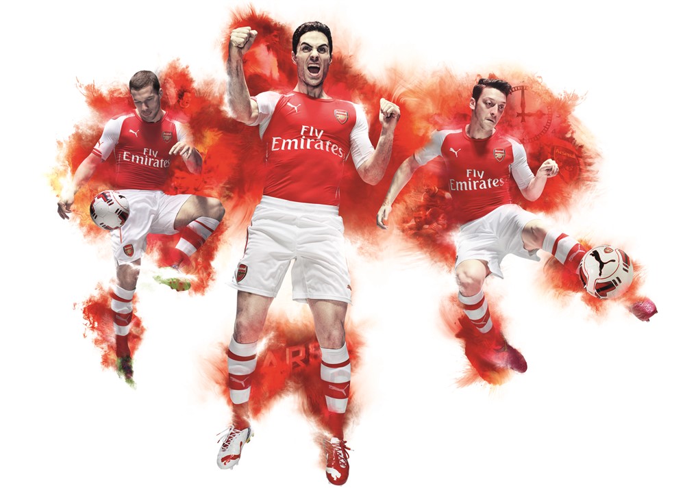
We look at past kits worn by the Gunners by Puma.
It’s official. The 2018/19 season will be Puma’s last as Arsenal’s kit manufacturer. The baton will be passed on to adidas as announced by the Arsenal Twitter account. Puma have been producing Arsenal kits from the 2014/15 season and feedback from fans and ex-players have been mixed to say the least.
That said, preferences can vary from fan to fan and views on the quality of recent kits have been as divisive as the “Wenger Out” debates.
Are you Puma In or Puma Out? Let’s look back at some of the good, bad and downright ugly offerings from the big cat.
The Good
Home – 2014/15
Puma rode on the wave of euphoria as the launch of their first kit came just after Arsenal won their first title in 9 years with the FA Cup. They launched a slick marketing campaign about the club’s history and a bright future with the club.
The video ticked a lot of boxes and the home kit was pretty decent though it has to be said, Puma played it safe with the design. The skin tight “player’s version” also incorporated tech such as heat transfer tapes to reduce body heat. Pretty cool stuff overall.
Away – 2014/15

Another decent jersey from Puma’s first season, the away top featured colours from the popular yellow/blue combination that have played a part of Arsenal’s rich history –the last gasp win over Liverpool in ’89 and the Invincibles season of 03/04 to name a few.
We won a second FA Cup in style in this jersey which seals its place as one of my favourites in recent years.
Home – 2015/16

Puma’s sophomore year brought us this home jersey which saw them attempting to add in a little sartorial flair into their designs.
The granddad collar was making its way back into fashion and Puma used that as an opportunity to add a little something to the home kit. The gold trims were a nice touch but Puma still kept it safe with the look.
Training Kit – 2015/16

One of my personal favourites was this training kit from the 2015/16 season. It looks modern and I was a fan of the stripes and dark blue area on the top left-hand corner of the shirt.
That said, I wouldn’t recommend putting it on after a heavy meal as the top cuts a very slim fit especially around the mid-section.
Training Kit – 2018/19

Fast forward to the Emery era and I’ve really taken to the training kits worn by the team this season. Perhaps it’s the excitement of a new regime, or maybe because I saw them wear it up close for a week while I covered them on tour in Singapore.
My personal favourite is the grey version which is predominantly worn by the players. Look closely and you’ll notice that the logos and trims across the sleeve has a slightly purplish, holographic shimmer to it.
Third Kit – 2018/19

A polarising one but I really like the mint/dark blue combination on the third kit. This was another attempt by Puma to sprinkle a bit of lifestyle in their sportswear and I really dig it. And if we’re going with adidas, expect more flamboyant colours and designs as they’re trying very hard to mix lifestyle into their football apparel too.
The selection of this very jersey could be biased though, as they launched it in my hometown on the recent tour and also sold a limited edition print featuring popular icons in Singapore. Safe to say, I got myself a set.

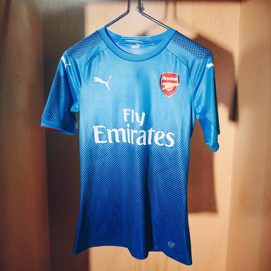
Stadium – 2018/19

The “Stadium kit” is usually only worn by the players on the sidelines but they’re easily the nicest of the bunch. It’s predominantly white in front but the back features a deep red colour with a metallic sheen to it.
It’s plain, simple but very classy. Shame we won’t see too much of it over the course of the season.
Honorable Mention: Home – 2018/19

I hated this when I first saw it but I have warmed up to Puma’s last home jersey for the Arsenal. It’s got a nice modern cut and a deep shade of red on the torso built with a rather breathable material.
I’m still on the fence regarding the stripes on the sleeves but overall, it’s not bad at all.
The Not So Good
Third Kit – 2014/15

While the aforementioned marketing campaign for Puma’s debut season had the home and away jerseys representing the glorious past, Puma ominously had this horrendous third kit represent the future. I blame Puma for cursing the club with this awful number.
Predominantly clad in light and dark blue, they formed a sash formation on the shirt with lime green trims. The only good memory I had of this jersey was Danny Welbeck scoring the winner against United in the FA Cup and that’s as good as it gets.
Training Kit – 2014/15
Did someone design this using Paint on Windows 95? The less said about this, the better.
Third Kit – 2015/16

I liked the extremely dark shade of blue forming the base of the design (or was it a lighter shade of black?) and the gold trims. But Puma decided to play mad scientist and throw in a little turquoise and white and mix it up in a strange sash design that just didn’t work.
Why couldn’t it just be plain black and gold, Puma? Why did you treat us to this abomination?
Goalkeeper’s Jersey – 2016/17

Did the printer run out of ink when they decided to sketch this design? The colour panel on the sleeve reminds me of a colour printer’s CMYK cartridge – a really odd design choice to make.
Away – 2017/18
My eyes! The light blue top did not look right to me and not even the gradient effect could save this jersey from being one of the most underwhelming tops I have seen released for the Arsenal. It reminded me of a training kit instead of an official match day jersey.
Just like the Gunner’s horrible away form during the course of the season, this jersey is one to forget.
Goodbye Puma, Hello adidas
It’s been a mixed bag by Puma and I’m certainly looking forward to see what the 3 stripes can bring to the table (besides more money of course). Adidas has certainly upped the ante in the last few years with designs that blend elements of street culture, lifestyle and sportswear.
This season alone, they’ve launched a light pink away jersey for United (their best seller), a mint top for Bayern not too dissimilar to our third kit and also some stellar kits from the recent World Cup.
Will we be getting back the “bruised banana”? I’m not too sure about it but I have a feeling I’ll be enjoying the ride with the three stripes.
This article first appeared on the Arsenal Vision Podcast.


[…] also has an arsenal (pun intended) of highly regarded designers in their ranks, but just for simplicity’s sake, imagine a Messi x […]