
")
July 2021 Update: Visit our list of the best football kits of the new 2021/22 season.
With Covid-19 hampering the football season, it’s been a long wait to see some of the best new kits of the 2020/21 season. It may be mid-September but alas, the brands have now revealed some of the best kits to be donned by the best players in Europe.
Below, we list what we think are some of the hyped kits that look just as good on the pitch as it will on the streets.
Roma Away
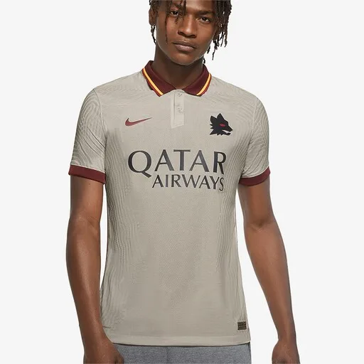
The Pride of Wolves
Nike Roma 20/21 Away Shirt - Pale Ivory/Fossil/Dark Team Red
Multiple stores
Roma always gets the best kits and this year is no exception. A beautiful ivory top with burgundy and yellow trims, this looks even better in person. This colour scheme is reminiscent of Roma’s glorious 80s period.
The pièce de résistance of this kit has to go to the iconic Lupetto badge, designed by the late Piero Gratton, which replaces the regular club crest. One for the collectors, I’m sure.
Inter Milan Home
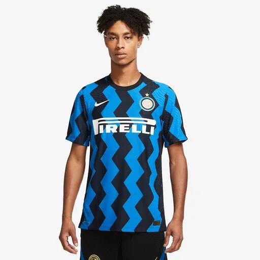
A tribute to the “Biscione” snake
Nike Inter Milan 20/21 Home Match Shirt - Blue Spark/White
Multiple stores
Inter continues their hot streak of excellent kits with this year’s home top. So used to regular stripes, they broke convention with a horizontal zig zag pattern that pays tribute to their mascot, the Biscione – the symbolic serpent of the city of Milan.
A very unconventional but daring design for a team that looks to break the Juventus stranglehold of the Serie A.
Juventus away
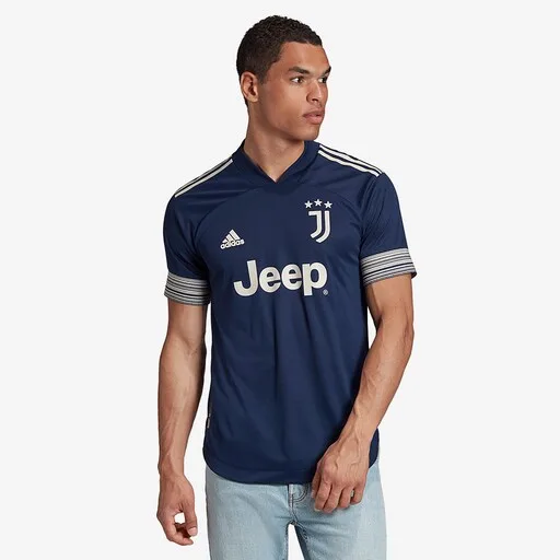
Cool as night
adidas Juventus 20/21 Away Authentic Shirt – Night Indigo/Alumina
Multiple stores
Serene, calm and understated. This is true, not only of new manager and Juve legend, Andrea Pirlo, but the same can also be said of the Juventus away kit. It is said to take inspiration from evenings in Turin with its deep indigo colour and sleek silver details.
This looks like class, perfect for an effortless midfield conductor pulling the strings and adding silk to the team’s play.
Barcelona Away
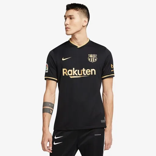
Black and Gold
Nike FC Barcelona 20/21 Away Shirt - Black/Metallic Gold
Multiple stores
There’s so many things going wrong at Barcelona right now but their away kit is not one of them. Black and gold is always a recipe for success and this is just a must have for the sartorially forward football fan.
Here’s to hoping De Jong, Messi and Pique do this kit proud as they embark on Koeman’s first year at the helm.
Real Madrid Third

Dark elegance
Real Madrid 20/21 Third Shirt Authentic – Black
Multiple stores
For a team that loves its clean, white aesthetic, Madrid’s pretty fond of a little more flair in their away and third kit variants. This year’s away kit is pretty sweet in an all-pink design but it’s upended buy a more elegant third kit.
Featuring a subtle black and grey baroque pattern across the front, the jersey is inspired by the iconic Azulejo tile art paintings which adorn the city of Madrid. The pink accents accentuate this work of art and helps make the kit pop. A must have this season.
Valencia Away

Avant garde chic
Valencia 20/21 Third Kit
Prodirect Soccer
Valencia’s a really beautiful city by the Mediterranean Sea. Puma did good by incorporating the style from local artist, the late Joaquín Sorolla, in displaying that very beauty through a combination of grey, lavender and sky blue on a soft print.
It’s the most artistic of the kits featured on this list, perfect for the silky smooth player who loves art
Arsenal Away
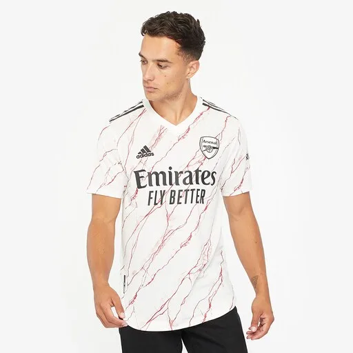
Highbury class
adidas Arsenal 20/21 Away Shirt - Cloud White/Black
Multiple stores
As an Arsenal fan, I was undecided on this. Conceptually, this is pretty neat with a tribute to the elegant marble hallways of the old Highbury stadium. In practice, this seems a little like strawberry ripple ice cream or worse, something Patrick Bateman would wear.
With time passing since the release, I’ve come to appreciate this kit and it definitely looks class on the pitch as seen in their win over Liverpool during the recent Community Shield game. This could even looked upon as a modern classic ala the bruised banana in years to come.
Manchester City Home
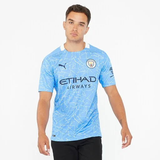
Mosaic Mash-up
Puma Manchester City 20/21 Home Shirt - Team Light Blue/Peacoat
Multiple stores
Puma’s first home kit for Manchester City last season was pretty plain but I loved that they took some risk with their sophomore release for the club. The mosaic pattern is a tribute to the artwork located in the creative hub of Manchester’s Northern Quarter.
The unconventional design has a whiff of training kit to it but I think it’s a bold look that should be commended.
Manchester City Away
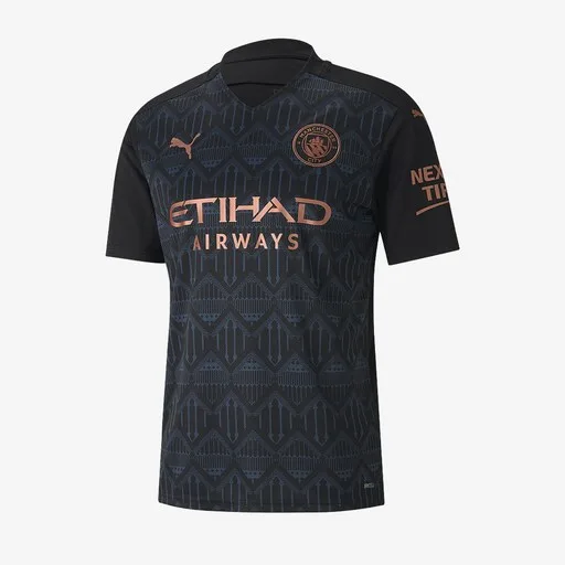
Bronze Beauty
Puma Manchester City 20/21 Away Shirt – Puma Black/Dark Denim
Multiple stores
The Big Cat didn’t just stop at the home kit. They pulled out their best work for the away kit as well. This dark number features a stunning motif inspired by the structures and pattern of Castlefield and the Bridgewater canal.
The copper detailing just pops elegantly against the dark blue and black base of the shirt making this one of the best football kits to grace the 20/21 season.