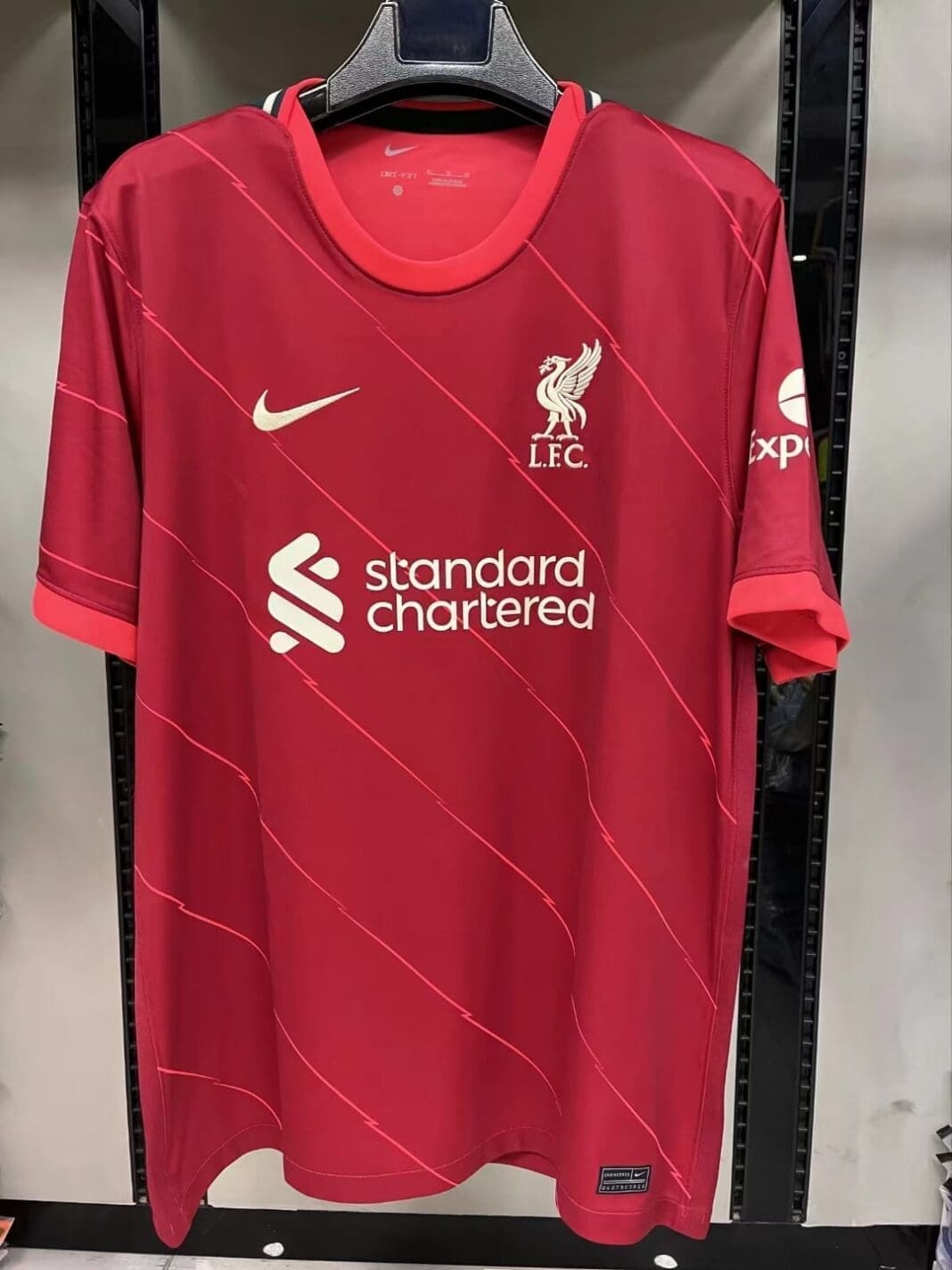
Nike had clearly taken the conservative route with the 2020/21 home kit design and it seems that the upcoming 2021/22 kit continues with the same conservatism.
It looks pretty similar to this season’s plain home kit, this time moving the green striped around the collar towards the back of the neck. We’ve seen Nike include their lightning designs on jerseys and also on their boots and it seems that the Liverpool home kit won’t be spared.
The inclusion of diagonal lightning stripes across the top is going to be divisive at best and we feel that most Liverpool fans won’t take this new kit to heart.
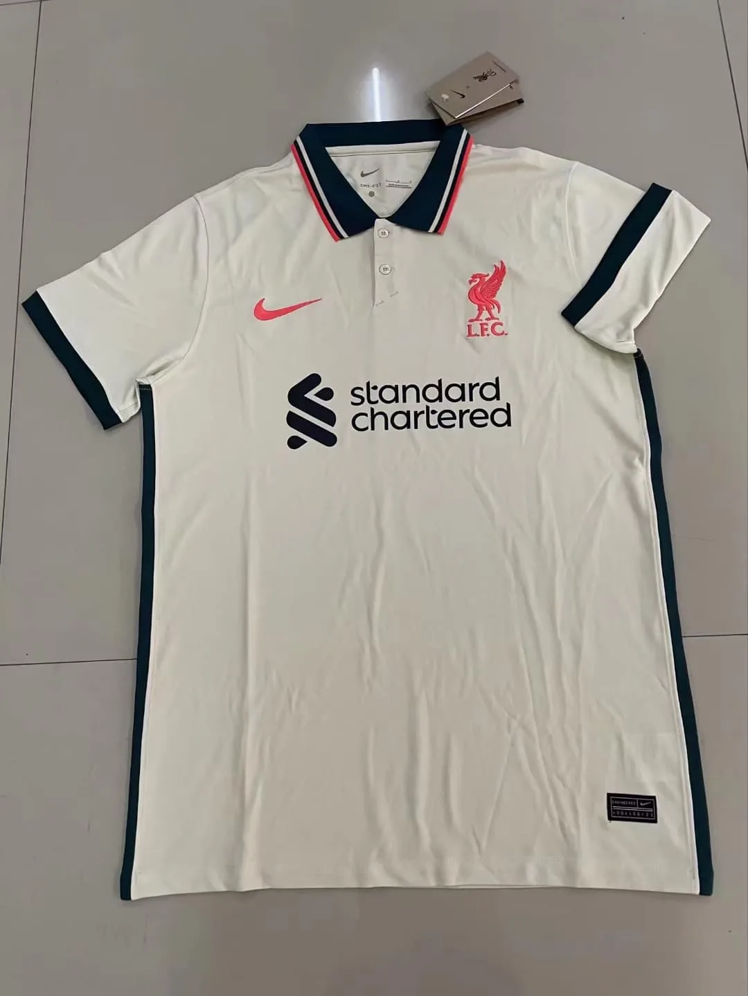
Continuing on with their conservative approach to the Liverpool kits, Nike have gone for a classy, buttoned up Polo T design for next season’s Liverpool FC Away kit. I’ve always loved the preppy polo tee look, channelling its Fred Perry-esque vibe.

Unfortunately, this shouts less preppy high fashion, and more middle-aged uncle. The cream colour base works decently with the black trimmings on the sleeves, but something about that collar just doesn’t work for me. At least the Standard Chartered logo’s in black, which blends in well with the black trimmings, instead of being its own green colour.
When Nike first captured the rights to produce the Liverpool kits, there was a good amount of concern among Liverpool fans at how boring Nike’s kits had been. To counter that, Nike designers mentioned in interviews about how they’d revamped their design process and designers had access to over 70 different designs of each individual parts of the jersey, from the collars, to the sleeves to the jersey itself.
With these kits, questions are going to be asked of Nike’s designers and their “process”.


