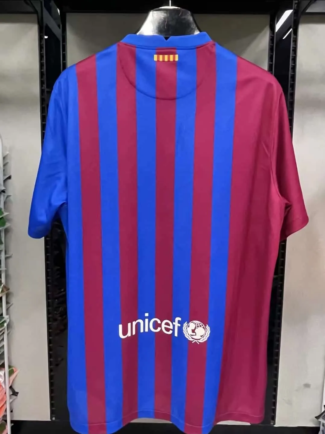
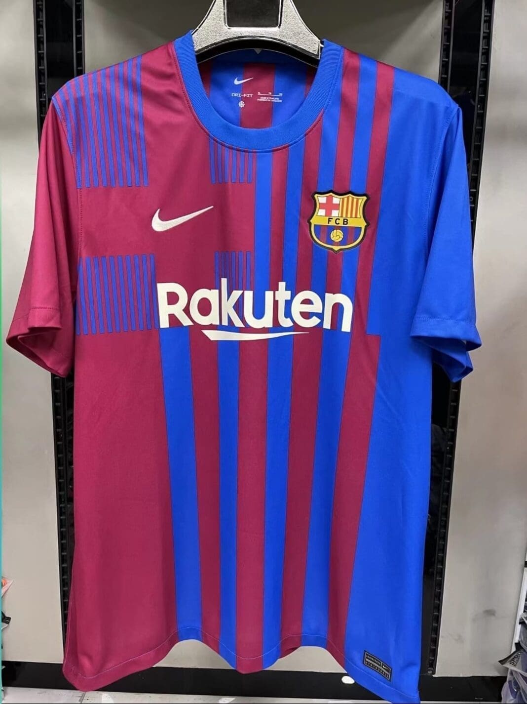
The FC Barcelona home kit for the 2021/22 season will feature a bold design that hasn’t been attempted before. While the colours remind me of the FC Barcelona home kit of the 2005/06 season, I was a little confused seeing so many different stripe patterns across the jersey.

Upon further inspection, you’ll notice that all the patterns reflect the design of the club crest – Saint George’s cross, the thin yellow and red stripes representing Catalonia, and the bottom quarters featuring the club colours.
It’s an extremely busy looking design that is more complicated than the clean designs that Nike is well-known for. The stripes are a little more simplified on the back where the width of each stripe is more uniform with each other.

What do you think of the FC Barcelona Home Kit 2021/22? Would you wear the stripes with pride or is the design too busy for you? Let us know in the comments below.


At last they have got the colours right……..but this kit is so poor on so many levels imo. The final straw being the half/half shorts. I think it is systematic of the old board and Bartolomeu era. Hopefully with Laporta, traditional stripes, claret and blue and a return to normality.